watch I had an embarrassing secret for many years.
https://www.thefwpc.org/tutoring/ Like a ’90s fanatic with a collection of Beanie Babies or Rick Astley CDs, I was desperately clinging to something that I had outgrown.
https://nerdexp.com/top5anime/ Only in my case it wasn’t a physical relic of yesteryear, but rather a digital footprint that felt a little old fashioned: my website.
here Here’s the story of how my friend and super talented designer Lindsey Selden helped me rethink and revamp my website to make it a better reflection of myself and my services.
The problem:
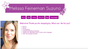
Order Prednisone For Sale My website was overly simple, static, and out of date. I’d built it myself to learn the basics of HTML and CSS, which was a great exercise, but it no longer reflected what I wanted to share with prospective clients. Plus, the process of making updates was time-consuming and tedious, and always required enlisting help from my brother because I never remembered how to do it on my own.
Lorazepam Online Order My old “Welcome” page was not as welcoming as it could have been.
https://leoniaarts.org/galleries/
The solution:
https://nerdexp.com/supermariobros3/ I knew I wanted a WordPress template so I could easily make updates and post blog content. I was already using WordPress for my blog and wanted to create a more consistent and cohesive experience between the main website and the blog. This meant selecting a WordPress template, setting it up, and customizing it to fit my specific needs.
http://www.sierrarealestate.net/best-subway-tile-looks-for-the-bathroom/ 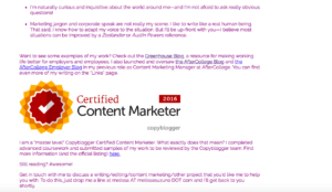
Buy Ambien Online Without Prescription Making a simple change like updating the Certified Content Marketer image would have taken me several rounds of edits and a somewhat frantic phone call to my brother—hence the fact that I was still using the image from 2016 even though it was 2018!
The process:
Buy Clonazepam Online Overnight Lindsey and I had an initial meeting to discuss what I needed, both in terms of copy and visual assets. We began with the big picture of defining broad categories for the website and then broke it down into smaller pieces. One of the most important questions she had for me was how to showcase my work. In the old version, I had a list of links—many of which were broken—that were organized by publication and presented without comment. It put a lot of burden on the reader to visit other sites to figure out what my writing is all about.
Purchase Tramadol Without A Prescription 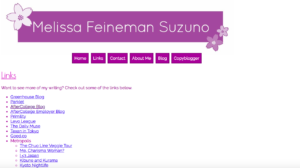
Buy Amoxicillin Online Without Prescription I was sending people on a wild goose chase to read writing samples—not the best user experience!
https://hsprental.com/request-a-quote/ We looked at sites for other people with similar businesses to get ideas. This led us to decide on the “content bucket” approach, where I broke my services into the main categories and gave an explanation and examples of each. This way, my website provides an overview of all the different things I do while also giving visitors the option to see specific examples.
https://mydentistwebsite.com/services/ 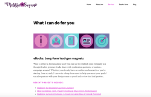
see Now readers can get a quick overview of my services without leaving my website and dig in to specific projects only if they’d like to learn more.
https://leoniaarts.org/galleries/ We also knew that we wanted to create a few visual assets to give my website a more personal look and feel. Before our second meeting, Lindsey put together inspiration boards to give us ideas for colors and illustration styles. In some cases, I had aesthetic preferences (e.g. I love purple—no big surprise there for anyone who knows me), and in other cases Lindsey had recommendations about what she sees as being trendy or appropriate. After we reached some decisions about the aesthetics, we decided that the areas where I’d need custom illustrations would be for my logo and icons to represent my suite of services. I love what Lindsey came up with! Check out the icons below for editing, email, eBooks, blog posts, and content strategy.
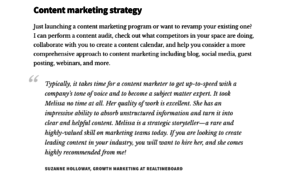
https://www.thefwpc.org/tutoring/ We also discussed including some other voices on the website as a form of social proof. After all, I work with some amazing clients, and they have positive things to say about working with me.
Here’s an example of one of the testimonials we included on my services page.
A few lessons learned:
- It’s a good idea to review your services and “About me” page from time to time. Both of these were outdated and this process helped me see that.
- Having an accountability buddy can work wonders. I’d been thinking of collecting testimonials for a long time, but didn’t get my booty in gear until I had a “deadline” assigned by Lindsey.
- Don’t be afraid to check out the competition. Seeing what other writers/content marketers were doing helped me solidify my understanding of what I wanted, especially when it came to showcasing my work.
- Even a platform like WordPress is not always super-intuitive, especially when you’re using a custom theme. Luckily, Google and YouTube are your friends, and you can find the answers to most questions/problems by searching for them and finding tutorials online.
I don’t think my site will ever be completely finished—I’ll continue to make updates and changes—but I’m happy that the new design allows me to do that much more easily. And in the meantime, I no longer have to feel like it’s my dirty little secret.

